The goal of jonohey is to provide color palettes inspired by Jono Hey’s sketches at Sketchplanations.
These palettes were not selected following criteria of color theory or accessibility. You might find that separability is not grat, especially when the number of colors is large. These palettes are intended for fun and to add a sketchy aesthetic to your visualizations. Use what works, toss the rest. Cution advised in professional settings!
Installation
You can install the development version of jonohey from GitHub with:
# install.packages("pak")
pak::pak("matiasandina/jonohey")
Example
These examples display the color palettes themselves. For utilization of the package, check the docs 📖.
library(jonohey, quietly = TRUE)
library(patchwork)
library(ggplot2)

plot_box_mtcars <- function(palette_name) {
  d <- transform(mtcars, cyl = factor(cyl))
  ggplot(d, aes(cyl, mpg, fill = cyl)) +
    geom_boxplot(width = 0.7) +
    scale_fill_jonohey(palette_name) +
    labs(title = "Boxplot: mtcars mpg by cyl")
}

plot_box_mtcars("suit")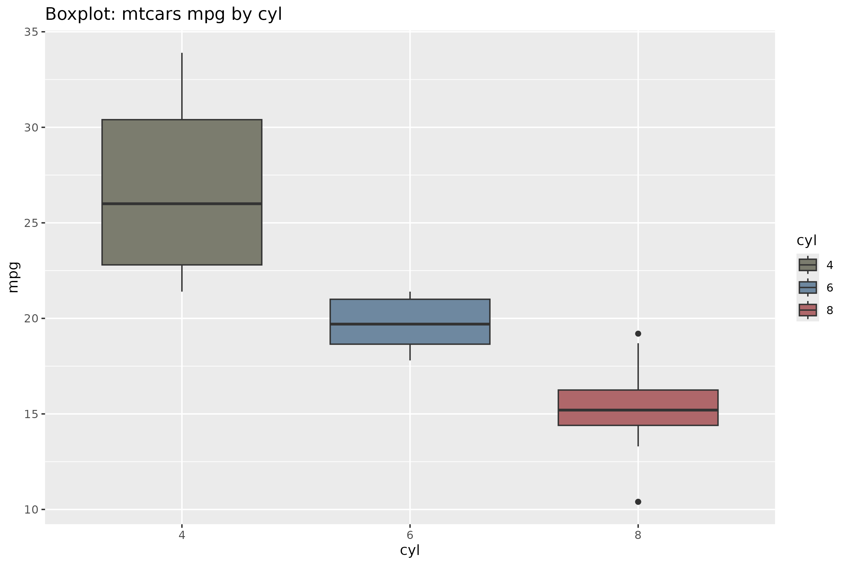
We provide themes to make this plot a bit more interesting (and closer in nature to their true sketch identity!).
# make a round panel!
plot_box_mtcars("suit") + theme_card(radius_panel = 18)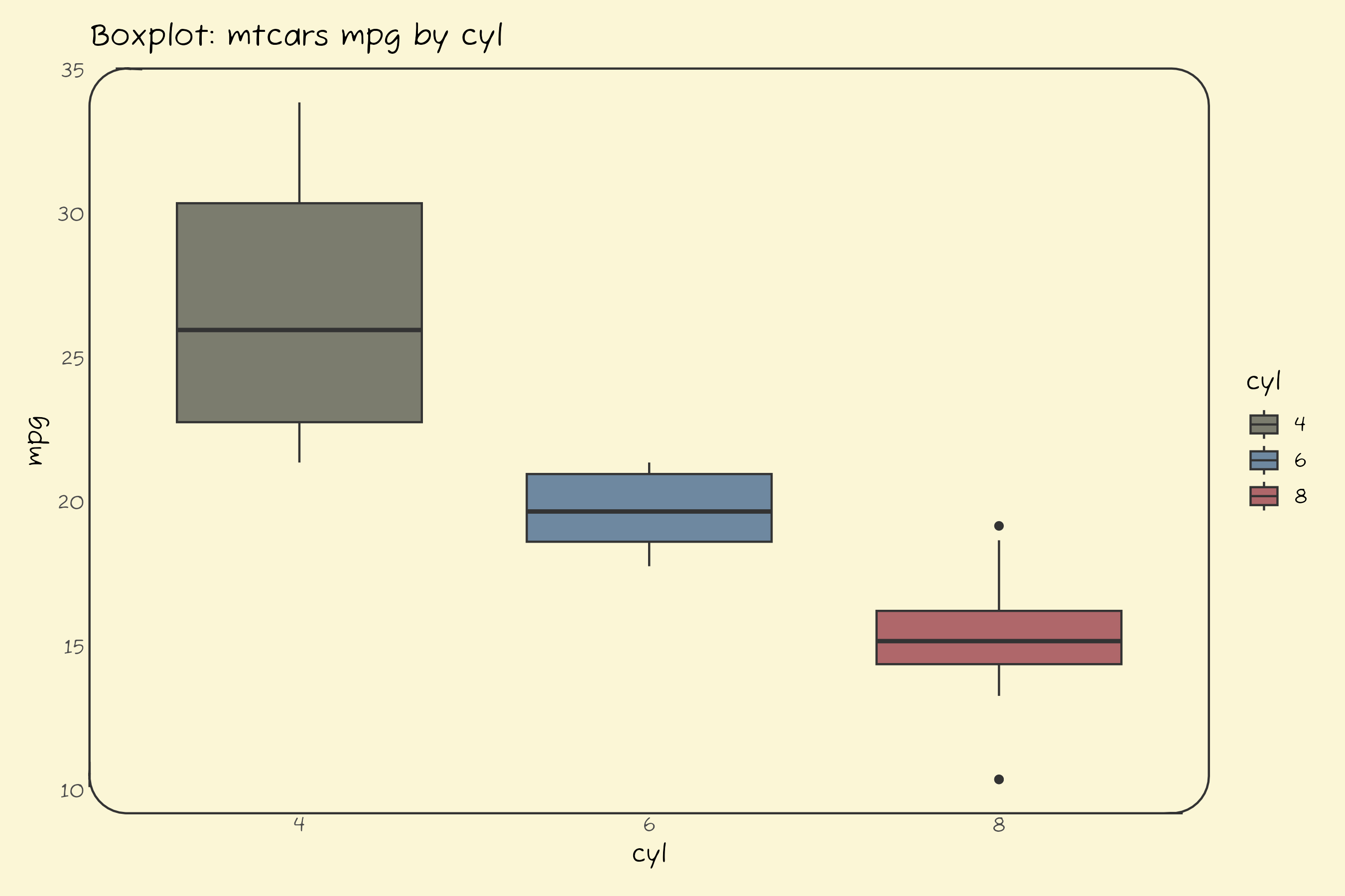
Typography matches exactly in saved figures or Rmd configured with
dev = "ragg_png". For interactive plotting,call jonohey_use_ragg()or install Fuzzy Bubbles system-wide.
# Make it more cartoonish
plot_box_mtcars("suit") + theme_axes_wiggle()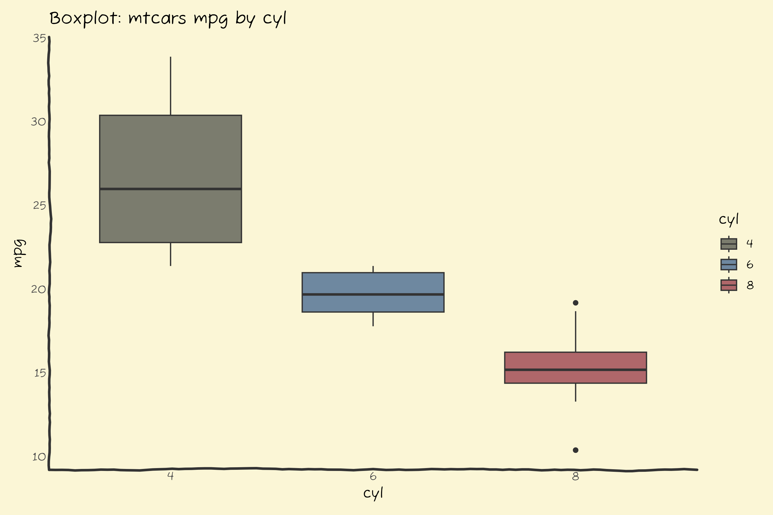
Check 📖 the docs!
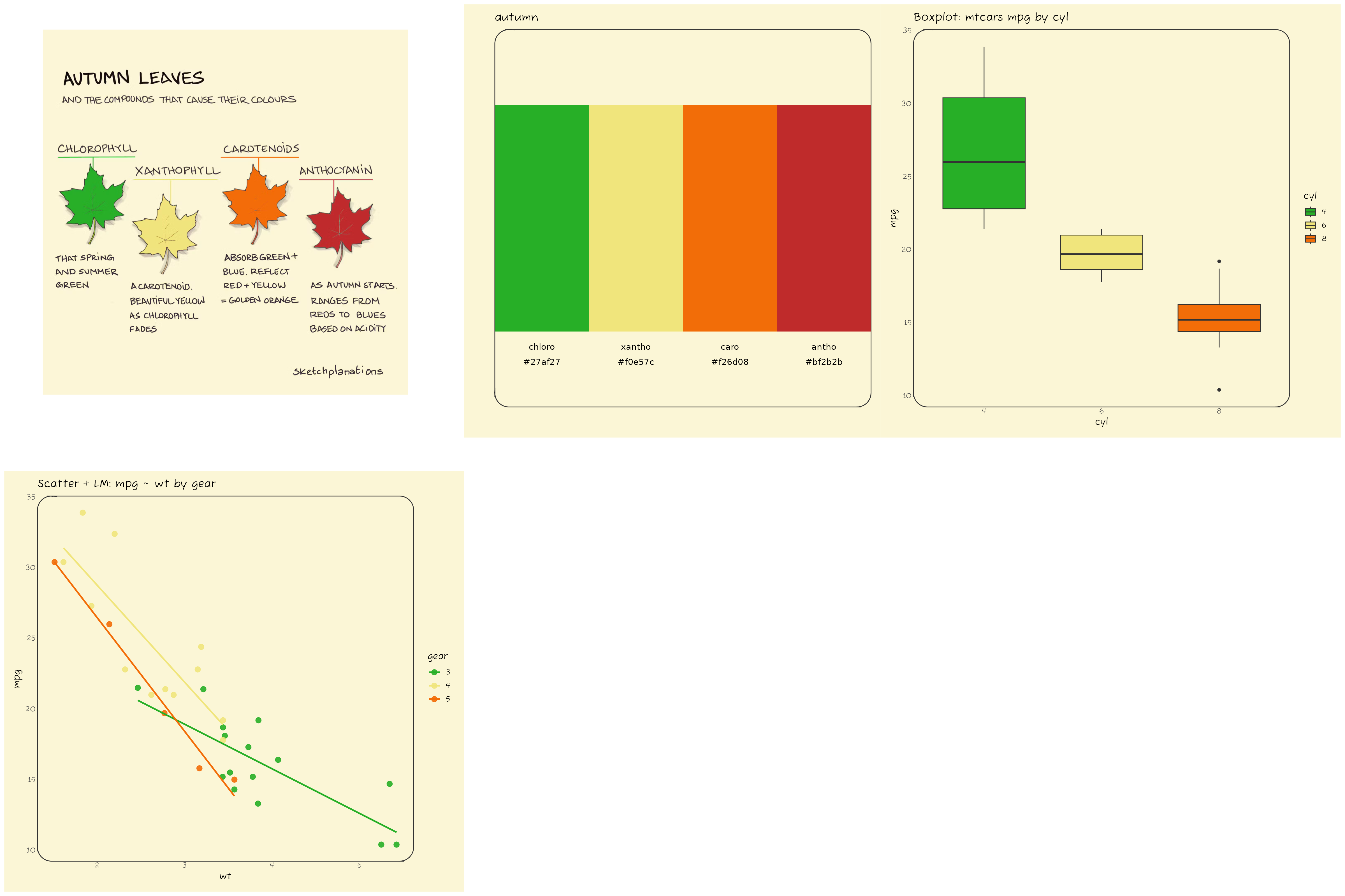
autumn
Below is the showcase for the autumn palette.
You can find the source for the sketch inspiring the palette at Sketchplanations
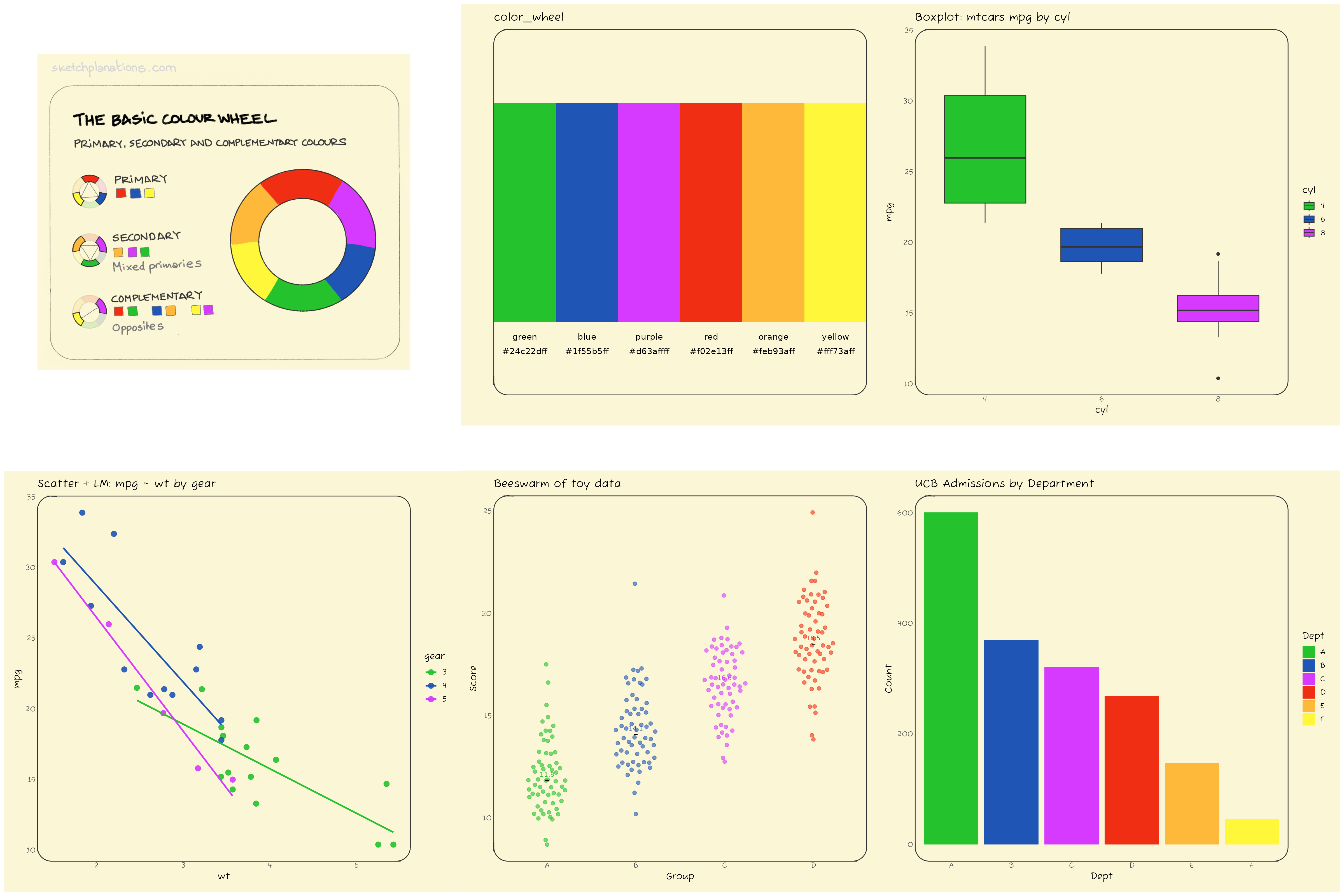
color_wheel
Below is the showcase for the color_wheel palette.
You can find the source for the sketch inspiring the palette at Sketchplanations
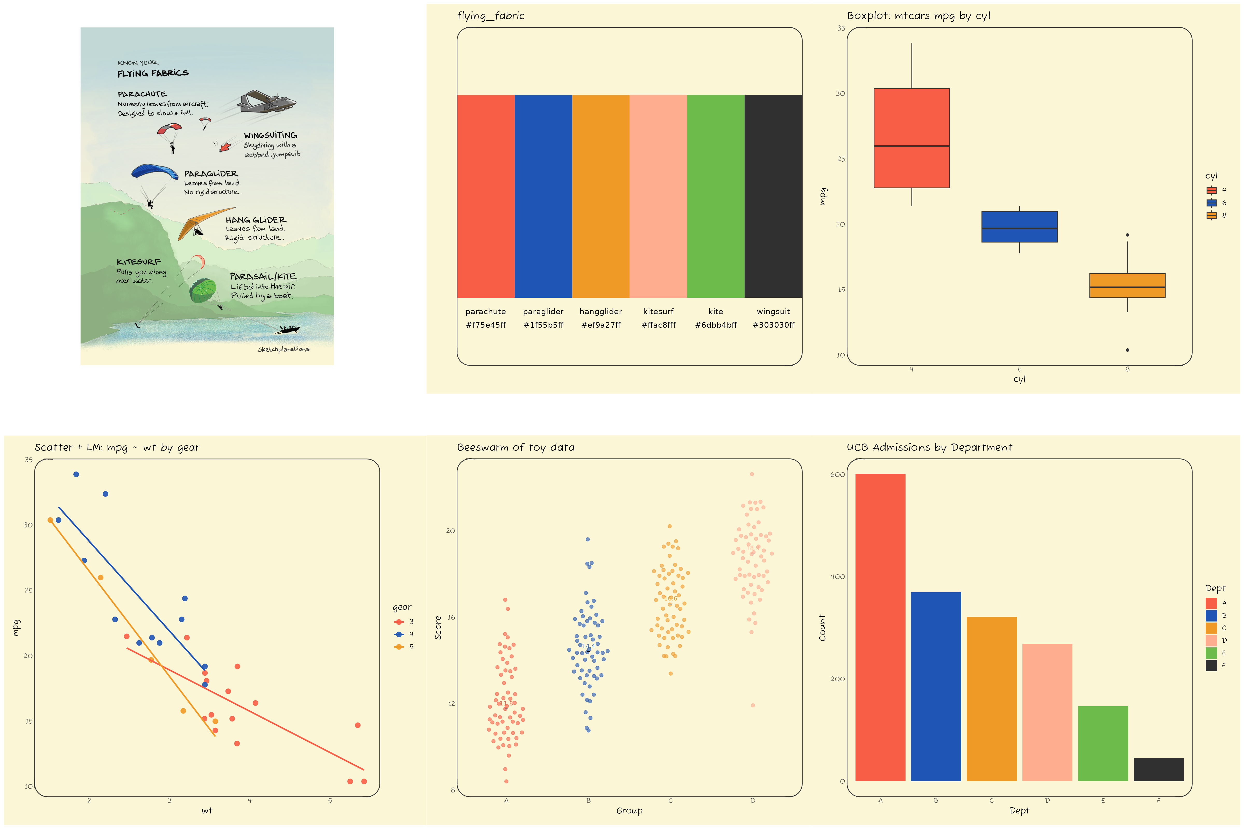
flying_fabric
Below is the showcase for the flying_fabric palette.
You can find the source for the sketch inspiring the palette at Sketchplanations
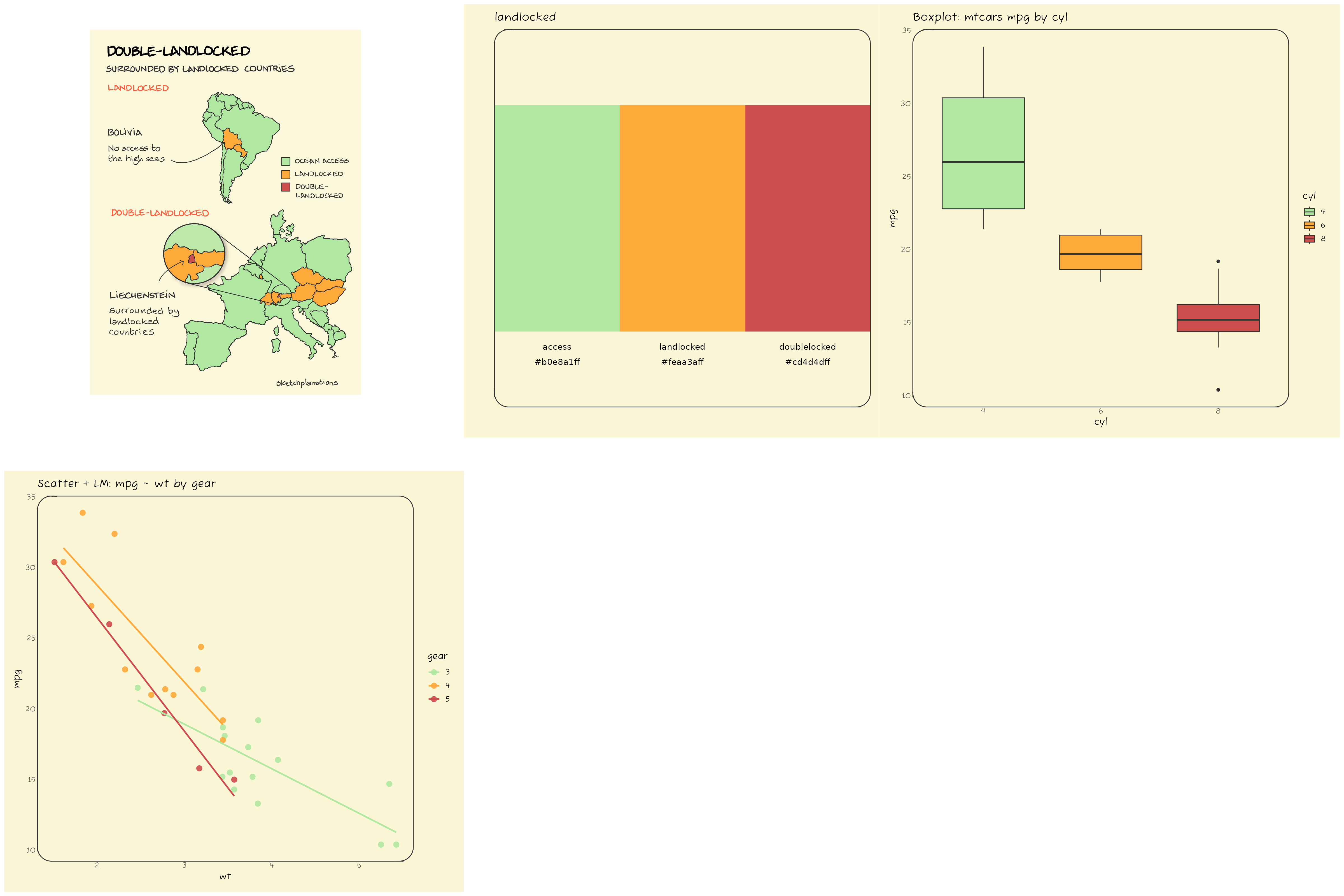
landlocked
Below is the showcase for the landlocked palette.
You can find the source for the sketch inspiring the palette at Sketchplanations
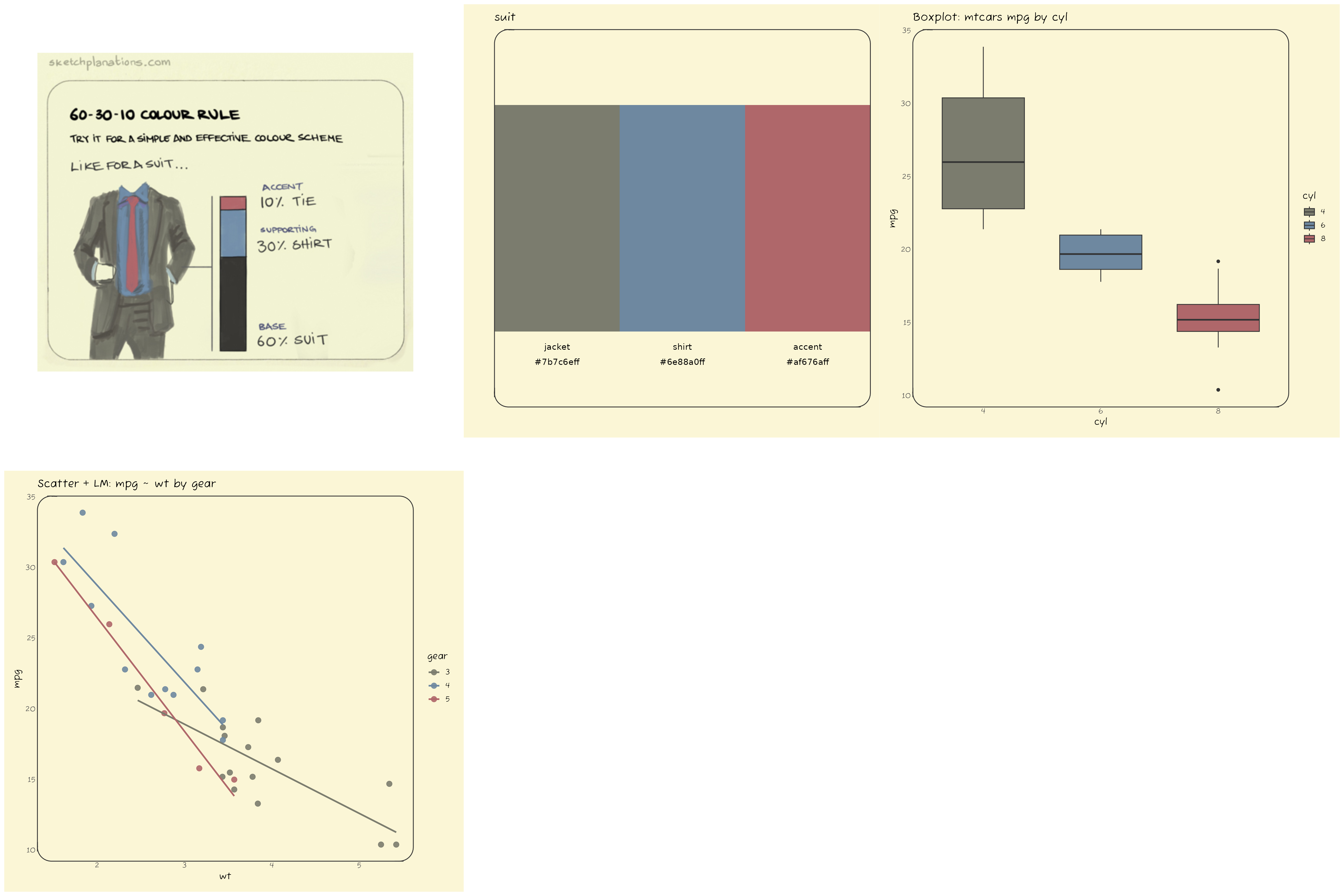
suit
Below is the showcase for the suit palette.
You can find the source for the sketch inspiring the palette at Sketchplanations
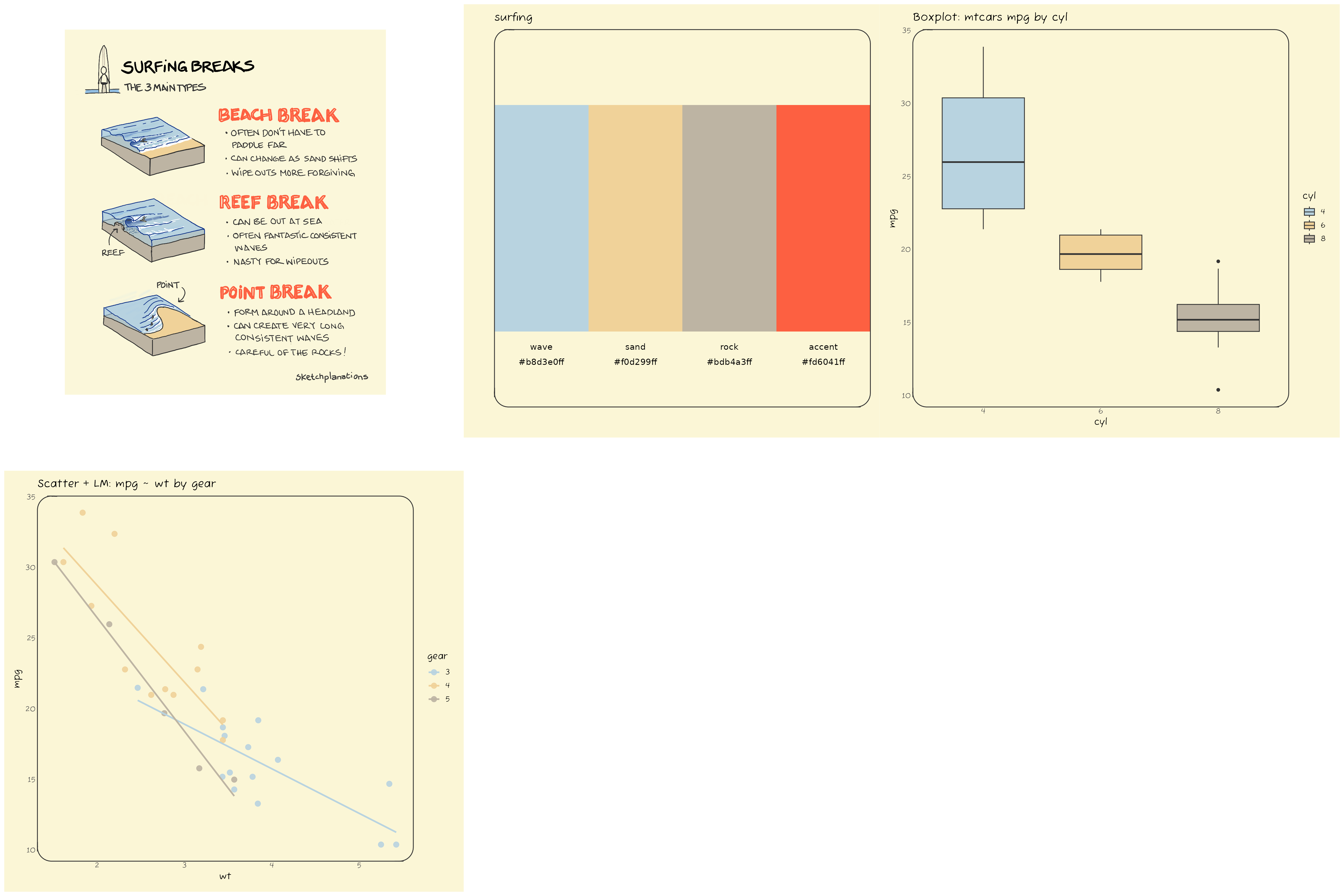
surfing
Below is the showcase for the surfing palette.
You can find the source for the sketch inspiring the palette at Sketchplanations
There are two palettes without associated images: “light” and “dark”. They contain 9 colors each, in light and dark tones respectively.
jonohey_show("light")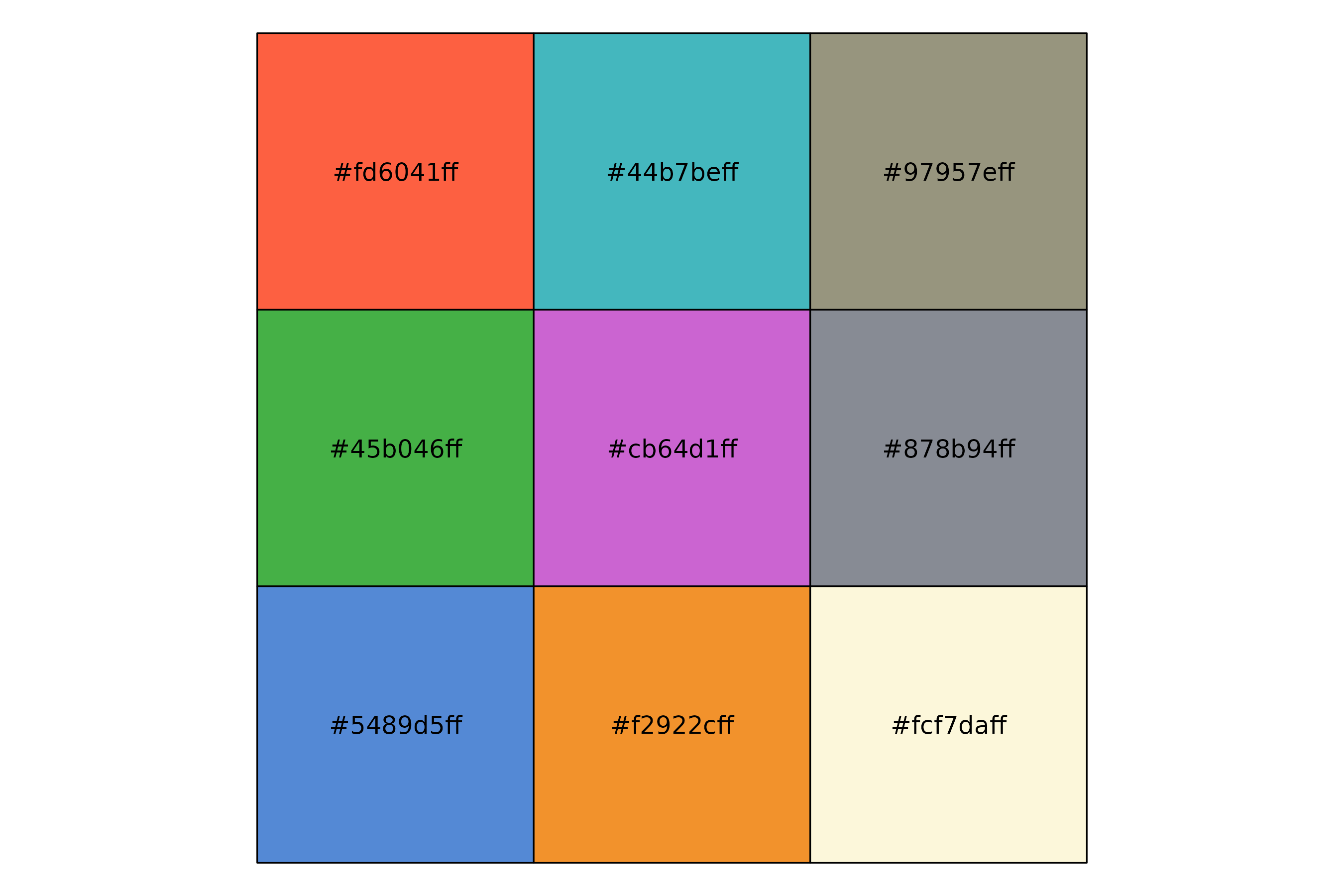
jonohey_show("dark")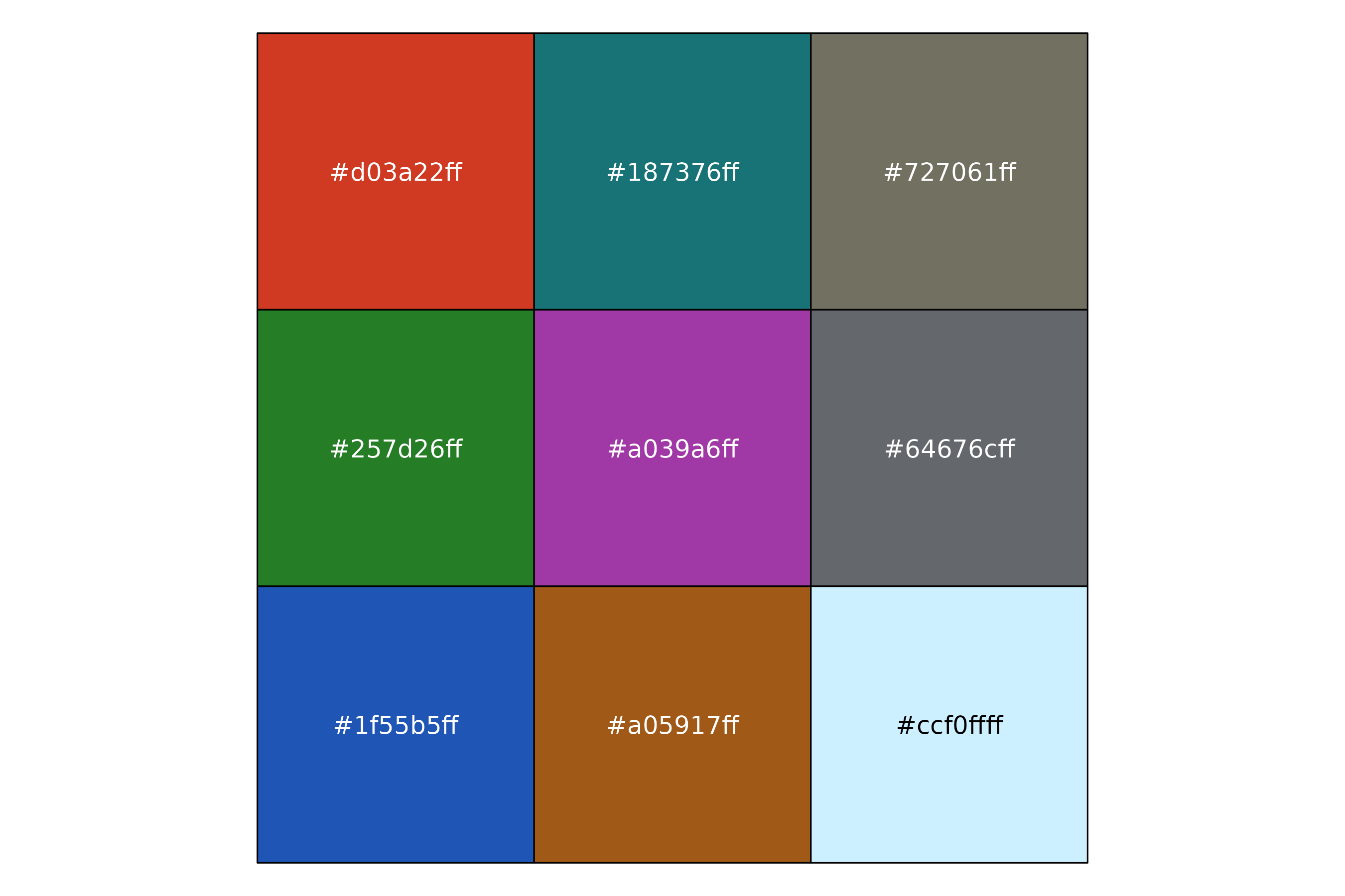
These palettes have 9 colors, which can be useful for plotting categorical data with many levels.
p_bar <- dplyr::storms  |>
  dplyr::count(status) |>
  dplyr::mutate(status = forcats::fct_reorder(status, n, .desc = TRUE)) |>
  ggplot(aes(n, status, fill=status)) +
  geom_col(show.legend = FALSE, color = "black") +
  theme_card(base_size = 12, radius_panel = 10)

xy_summ <- dplyr::storms |>
  dplyr::group_by(status) |>
  dplyr::summarise(
    n = dplyr::n(),
    wind_mean = mean(wind, na.rm = TRUE),
    wind_sd   = sd(wind,   na.rm = TRUE),
    pres_mean = mean(pressure, na.rm = TRUE),
    pres_sd   = sd(pressure,   na.rm = TRUE),
    .groups = "drop"
  ) |>
  dplyr::mutate(
    wind_ci = qt(0.999, df = pmax(n - 1, 1)) * wind_sd / sqrt(n),
    pres_ci = qt(0.999, df = pmax(n - 1, 1)) * pres_sd / sqrt(n),
    xmin = wind_mean - wind_ci, xmax = wind_mean + wind_ci,
    ymin = pres_mean - pres_ci, ymax = pres_mean + pres_ci
  )

p <- ggplot(xy_summ, aes(wind_mean, pres_mean, fill = status)) +
  geom_point(size = 3, pch = 21) +
  geom_errorbar(aes(ymin = ymin, ymax = ymax, color = status), width = 0, show.legend = FALSE) +
  geom_errorbarh(aes(xmin = xmin, xmax = xmax, color = status), height = 0, show.legend = FALSE) +
  theme_card(base_size = 12, , radius_panel = 10) +
  labs(x = "Wind", y = "Pressure", color = "Status") +
  theme(legend.position = "none",
  )


p_bar +
  scale_fill_jonohey("light") +
  labs(title = "Using the 'light' palette in dplyr::storms data") +
p +
  scale_fill_jonohey("light") +
  scale_color_jonohey("light")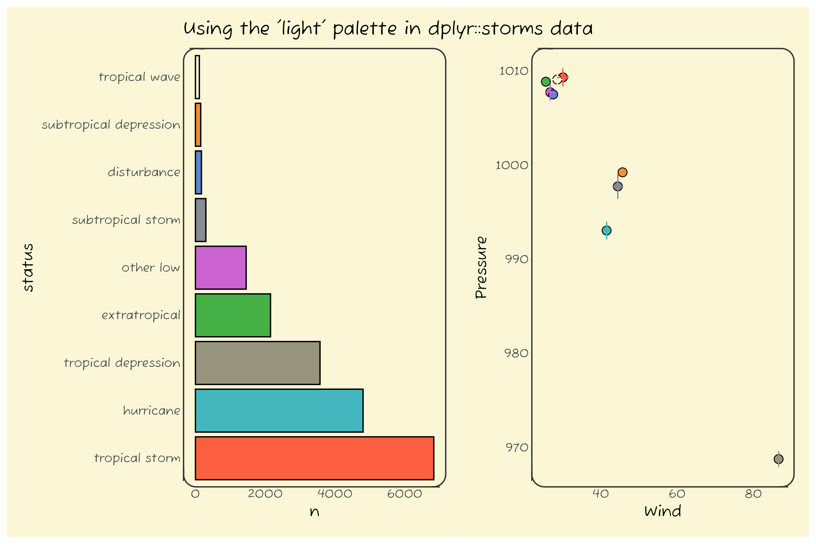
p_bar +
  scale_fill_jonohey("dark") +
  labs(title = "Using the 'dark' palette in dplyr::storms data") +
p +
  scale_fill_jonohey("dark") +
scale_color_jonohey("dark") 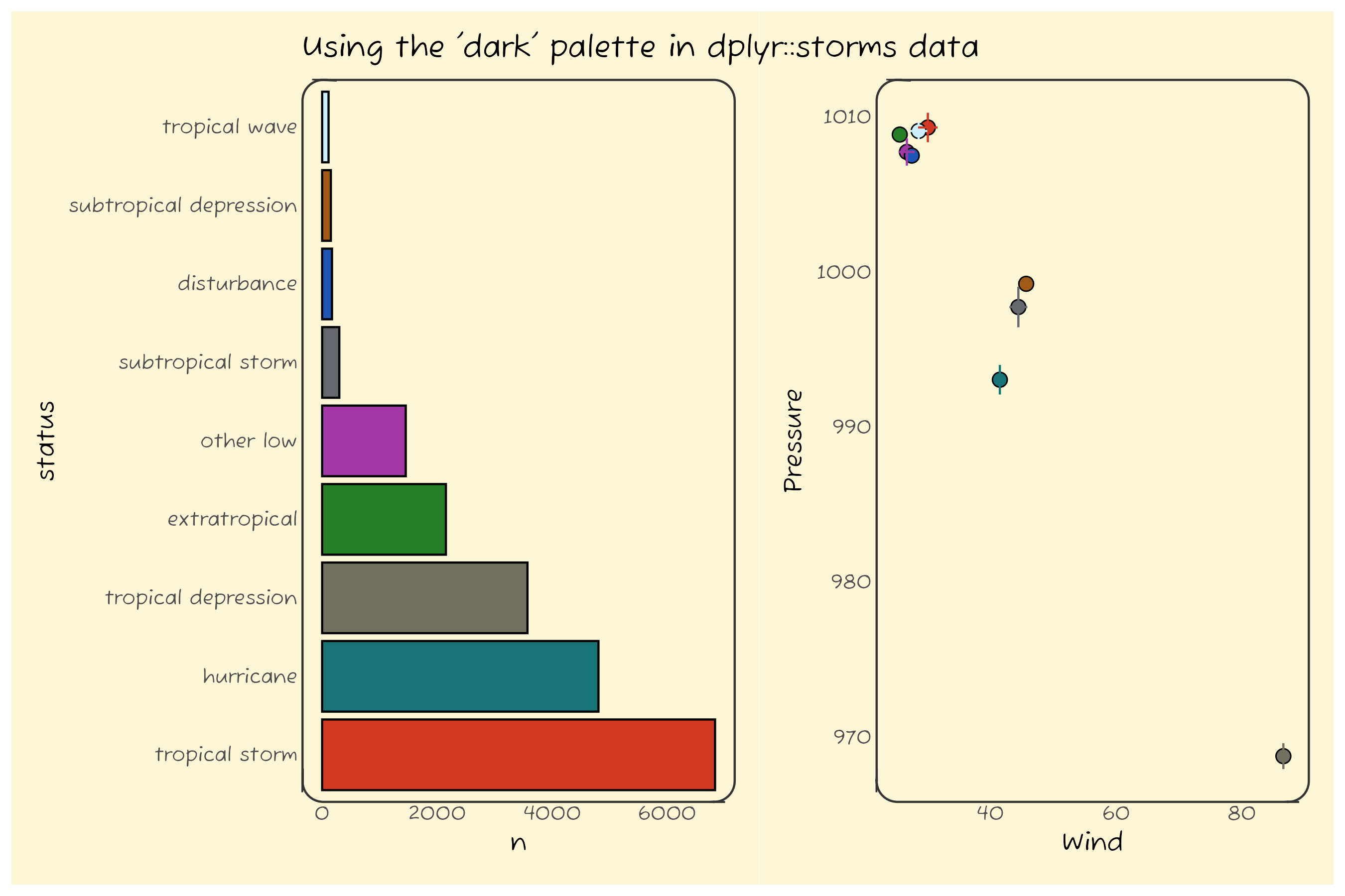
Using ragg for consistent typography
Since we provide a custom font (“Fuzzy Bubbles”) to match a sketchy look, we recommend using the ragg graphics device for saving plots to ensure consistent typography. You can do this by calling jonohey_use_ragg() once in your R session, or by specifying dev = "ragg_png" in your R Markdown document’s chunk options.
In Rstudio, you can also set ragg as the default graphics device in the Global Options under the “General” section. Check the Ragg’s documentation for more details.
In Positron, it seems that ragg is used by default if ragg >= 1.4 (see this PR). That’s why we require ragg >= 1.4 in the DESCRIPTION. We have tested jonohey_use_ragg() and it seems to work, but the scaling is worse than in RStudio.
Acknowledgements
Shoutout to Jono Hey for the inspiration and permission to use his sketches as a basis for color palettes!
You can find Jono Hey’s work at Sketchplanations.