This vignette walks through processing a single UID CSV file using
the functions in uid. A small example dataset is bundled
with the package, and serves to illustrate how the package works.
1. Reading raw data
file_path <- "path_to_your_data.csv"
# this will read and clean names, switch the datetime to proper datetime
raw <- read_raw_uid_csv(file_path)
The cleaning workflow assumes that each rfid maps to a
single matrix_name within a session. In practice, duplicate
matrix detections usually reflect mistakes such as matrices being placed
too close to each other or a cage being briefly placed on the wrong
platform.
When clean_raw_uid() detects the same rfid
on more than one matrix, it prints a summary table with
session_name, rfid, matrix_name,
n, %, min_dt, and
max_dt. Low-percentage duplicates can be removed after
explicit confirmation. If duplicate detections on the secondary matrix
exceed 10%, processing aborts and the file should be reviewed
manually.
The uid package provides sample data that emulates the
result of read_raw_uid_csv, and we can use it for the
tutorial.
head(uid_sample_data)
#>              datetime     rfid zone   session_name temperature matrix_name
#> 1 2025-01-01 00:00:00 A1B2C3D4    3 sample_session       37.16         MM1
#> 2 2025-01-01 00:00:20 A1B2C3D4    3 sample_session       37.24         MM1
#> 3 2025-01-01 00:00:40 A1B2C3D4    8 sample_session       36.66         MM1
#> 4 2025-01-01 00:01:00 A1B2C3D4    2 sample_session       37.25         MM1
#> 5 2025-01-01 00:01:20 A1B2C3D4    3 sample_session       36.98         MM1
#> 6 2025-01-01 00:01:40 A1B2C3D4    4 sample_session       36.98         MM1
2. Cleaning and outlier removal
UID raw data export might come with outliers from wrong detections.
We use a simple filter based on point-to-point difference and a
threshold. This approach works well for raw data with fast sampling rate
(e.g., sampling rate lesser than 1 minute) and it’s implemented via
flag_temperature_outliers(). If your data comes from a slow
sampling rate (e.g., sampling rate in the tens of minutes), this
approach might not be the best to remove outliers.
# jumps of more than one degree will be counted as outliers
flagged <- flag_temperature_outliers(uid_sample_data, threshold = 1)
# remove temperature outliers
clean <- dplyr::filter(flagged, !outlier_global)
You can visualize the flagged outliers with
plot_outliers(). This will save the plots to specific
locations.
plot_outliers(flagged, output_dir = tempdir(), filepath = file_path)For the purpose of this tutorial, we will plot the results here instead of saving them to file.
# example for flagged
ggplot2::ggplot(flagged, ggplot2::aes(datetime, temperature, group=rfid)) +
  ggplot2::geom_line() +
  ggplot2::geom_point(
    data = flagged |> dplyr::filter(outlier_global),
    ggplot2::aes(datetime, temperature),
    color = "red"
  ) +
  ggplot2::facet_wrap(~rfid) +
  ggplot2::scale_x_datetime(date_breaks = "6 hours", date_labels = "%H:%M")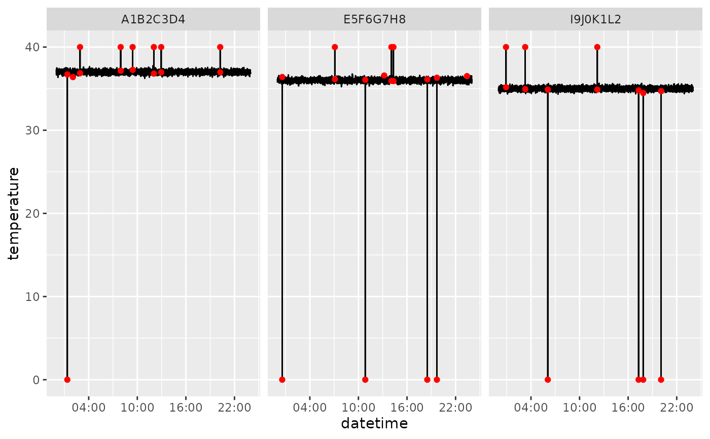
3. Activity calculation
Activity calculation is performed using the known distance between
the induction coil zones as given by the zone column in the
raw data export. You can check the zones with
uid:::.zone_coords
#> # A tibble: 8 × 3
#>    zone     x     y
#>   <int> <dbl> <dbl>
#> 1     1  0     0
#> 2     2  3.62  0
#> 3     3  7.25  0
#> 4     4 10.9   0
#> 5     5 10.9   3.16
#> 6     6  7.25  3.16
#> 7     7  3.62  3.16
#> 8     8  0     3.16
Euclidean distance calculations are therefore defined by the transitions from one zone to another. For example transitioning from zone 4 to zone 1 is a movement of 10.875000 inches.
head(uid:::.transition_distances)
#>   from to activity_index
#> 1    1  1       0.000000
#> 2    2  1       3.625000
#> 3    3  1       7.250000
#> 4    4  1      10.875000
#> 5    5  1      11.324806
#> 6    6  1       7.908736
🚧 Please make sure you are using the same platforms if you plan to use
calculate_activity()
The function calculate_activity() uses the
.transition_distances as a transition dictionary for
platforms with 8 zones.
with_activity <- calculate_activity(clean)4. Downsampling and interpolation
The sample data is provided with a sample interval of 20 seconds.
Because the timestamp that comes with real data detections will not be
the same for different rfid, there will not be a common
timestamp across rfid. This may or might not be a problem
for different analysis, but it is also often desired to aggregate the
data on longer intervals (e.g., 1 or 5 minutes). Using
downsample_temperature or
downsample_activity(), we can aggregate the data with
precision of 1 minute. A feature of this is that the operation is
performed by rfid (and other desired grouping variables).
As a result, will have all rfid sampled at the same
downsampled common_time.
down_temp <- downsample_temperature(with_activity, n = 1, precision = "minute")
down_act  <- downsample_activity(with_activity, n = 1, precision = "minute")
merged <- dplyr::left_join(
  down_temp, down_act,
  by = c("session_name", "rfid", "common_dt", "matrix_name")
)
Data acquisition might generate NA values that survive
downsampling. We included some of such gaps in the sample data.
dplyr::filter(merged, is.na(temperature))
#> # A tibble: 37 × 7
#>    session_name rfid  matrix_name common_dt           temperature activity_index
#>    <chr>        <chr> <chr>       <dttm>                    <dbl>          <dbl>
#>  1 sample_sess… A1B2… MM1         2025-01-01 03:28:00          NA             NA
#>  2 sample_sess… A1B2… MM1         2025-01-01 03:29:00          NA             NA
#>  3 sample_sess… A1B2… MM1         2025-01-01 03:30:00          NA             NA
#>  4 sample_sess… A1B2… MM1         2025-01-01 17:30:00          NA             NA
#>  5 sample_sess… A1B2… MM1         2025-01-01 17:31:00          NA             NA
#>  6 sample_sess… A1B2… MM1         2025-01-01 17:32:00          NA             NA
#>  7 sample_sess… A1B2… MM1         2025-01-01 17:33:00          NA             NA
#>  8 sample_sess… A1B2… MM1         2025-01-01 17:34:00          NA             NA
#>  9 sample_sess… A1B2… MM1         2025-01-01 17:35:00          NA             NA
#> 10 sample_sess… A1B2… MM1         2025-01-01 17:36:00          NA             NA
#> # ℹ 27 more rows
#> # ℹ 1 more variable: .flicker_corrected <lgl>
It might be desired to interpolate such NAs using
interpolate_gaps(). We can set add_flag = TRUE
to check what values were interpolated.
interp <- merged |>
  dplyr::group_by(rfid, session_name, matrix_name) |>
  interpolate_gaps(
    max_gap = 10,
    target_cols = c("temperature", "activity_index"),
    add_flag = TRUE
  )
dplyr::filter(interp, .interpolated) |>
  dplyr::select(rfid, common_dt, temperature, .interpolated)
#> # A tibble: 37 × 4
#>    rfid     common_dt           temperature .interpolated
#>    <chr>    <dttm>                    <dbl> <lgl>
#>  1 A1B2C3D4 2025-01-01 03:28:00        37.0 TRUE
#>  2 A1B2C3D4 2025-01-01 03:29:00        37.1 TRUE
#>  3 A1B2C3D4 2025-01-01 03:30:00        37.2 TRUE
#>  4 A1B2C3D4 2025-01-01 17:30:00        37.0 TRUE
#>  5 A1B2C3D4 2025-01-01 17:31:00        37.0 TRUE
#>  6 A1B2C3D4 2025-01-01 17:32:00        37.0 TRUE
#>  7 A1B2C3D4 2025-01-01 17:33:00        37.0 TRUE
#>  8 A1B2C3D4 2025-01-01 17:34:00        37.0 TRUE
#>  9 A1B2C3D4 2025-01-01 17:35:00        37.0 TRUE
#> 10 A1B2C3D4 2025-01-01 17:36:00        37.0 TRUE
#> # ℹ 27 more rows
By increasing the max_gap parameter, we will be
interpolating larger gaps.
We can visualize the results of the interpolation by slicing a portion of the dataset to make the linear interpolation more evident.
ggplot2::ggplot(interp |> dplyr::slice(200:300, .by = rfid), ggplot2::aes(common_dt, temperature, group=rfid, color = .interpolated)) +
  ggplot2::geom_line() +
  ggplot2::facet_wrap(~rfid) +
  ggplot2::scale_x_datetime(date_breaks = "30 min", date_labels = "%H:%M")+
  ggplot2::scale_color_manual(values = c("TRUE" = "red", "FALSE" = "gray20"))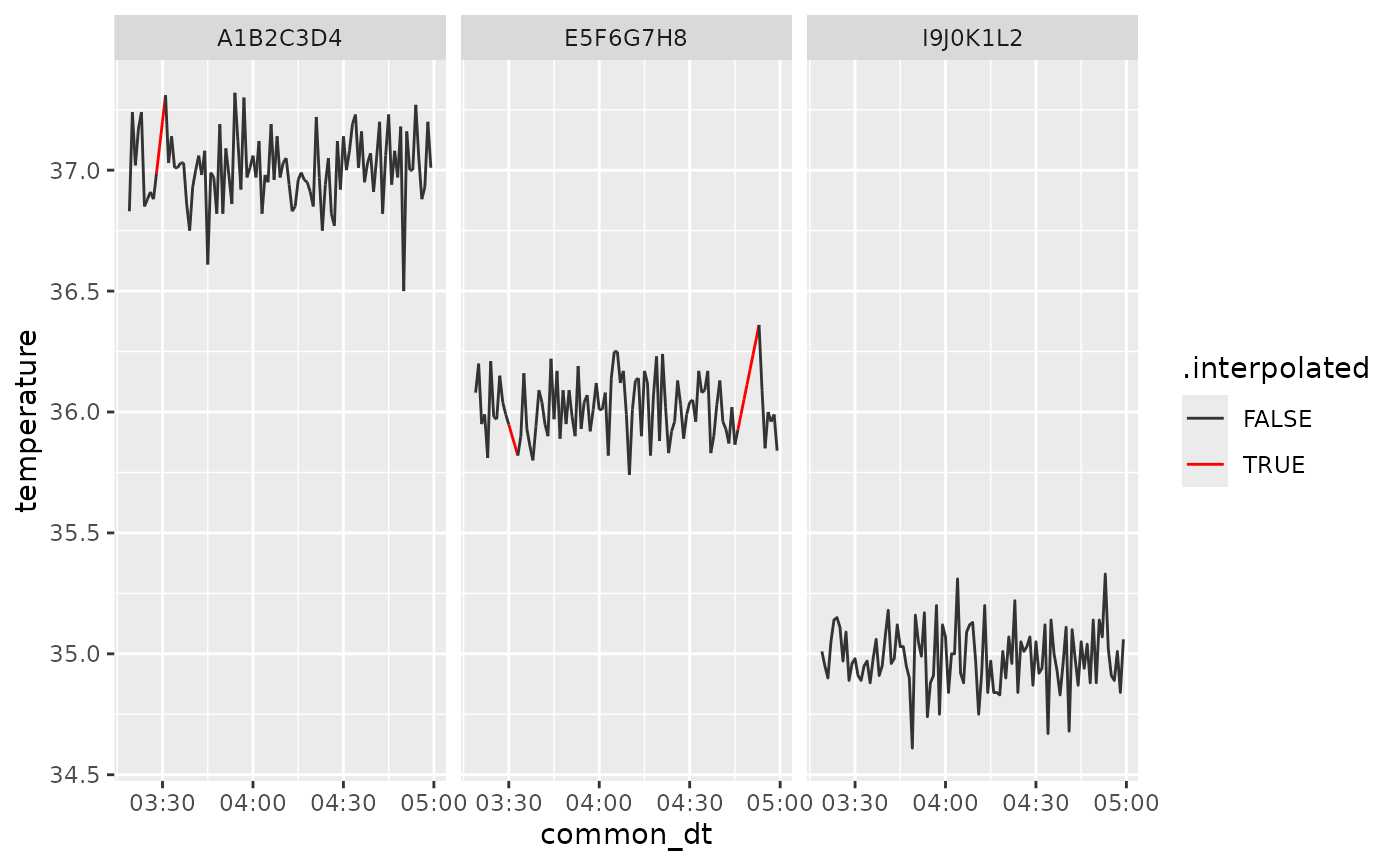
The interp data frame now holds cleaned, downsampled
values with short gaps interpolated. For processing multiple files
automatically, see the vignette on process_all_uid_files()
or (help("process_all_uid_files")).